
Trends 2022 is the main theme of the New Ebook by ACH Coll. and Hommés Studio! Discover everything we’ve prepared for you.

Onwards we live in nostalgia. The future will be longing for the positive changes that have been made to the way we think, live, and design. This longing for the past is a rebellious act against defeat. It is the celebration of resilience and optimism. The future is a throwback to the 60s and 70s, where the air is purer, hope is tangible and homes are funky and bursting with joyfulness.
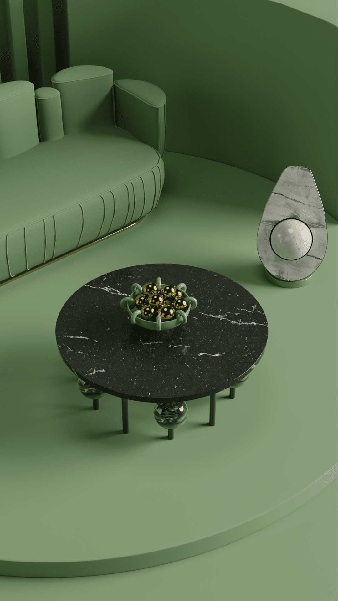
OLIVE BRANCH
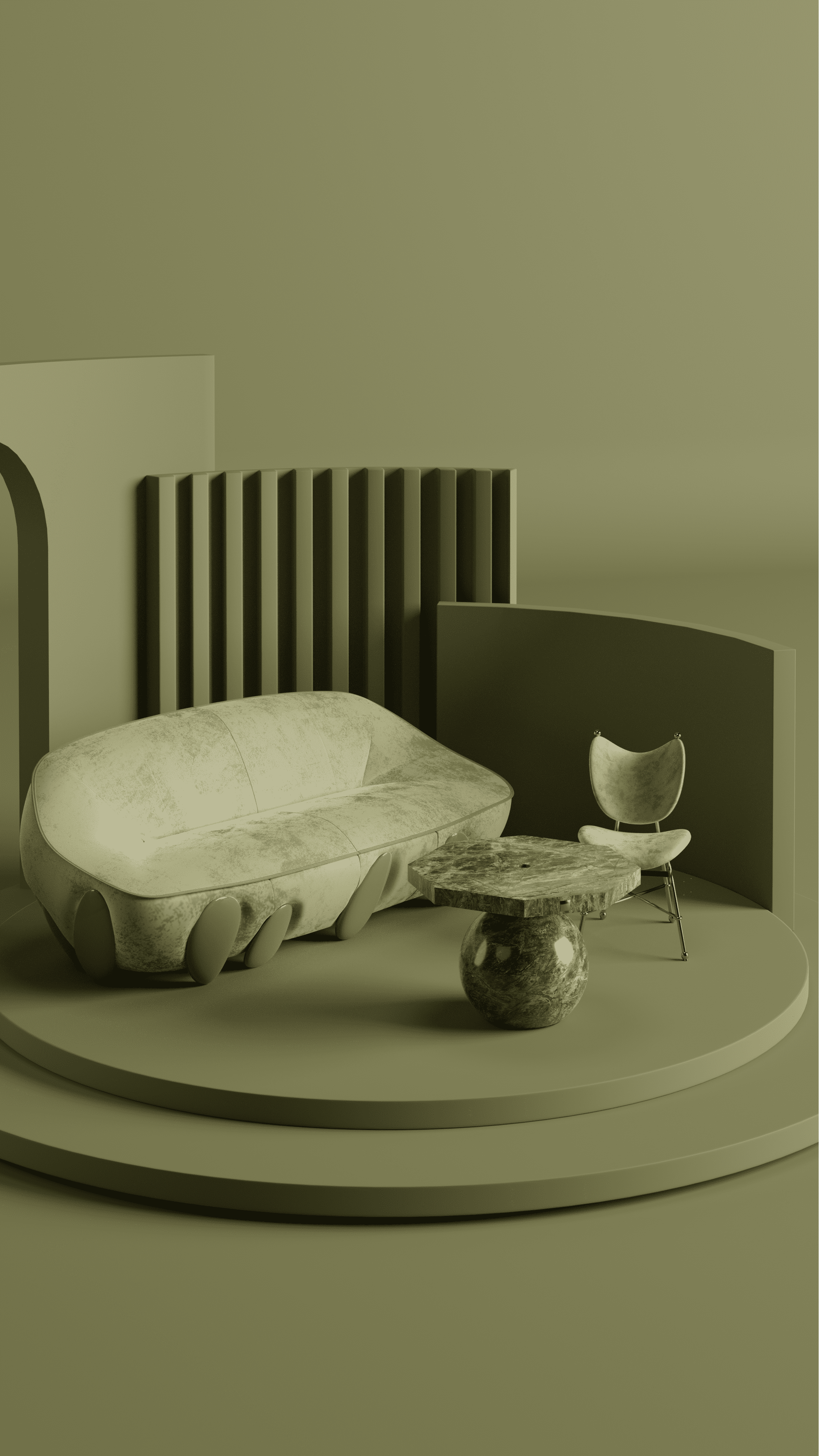
Olive Branch begins our Trends 2022 and we couldn’t be more in love with this color. It is the 60s revival, the color of velvet armchairs and shaggy rugs. It is also the core of classic martini and the chroma of the enchanted Mediterranean landscape.


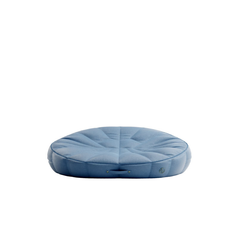
HARBOR BLUE
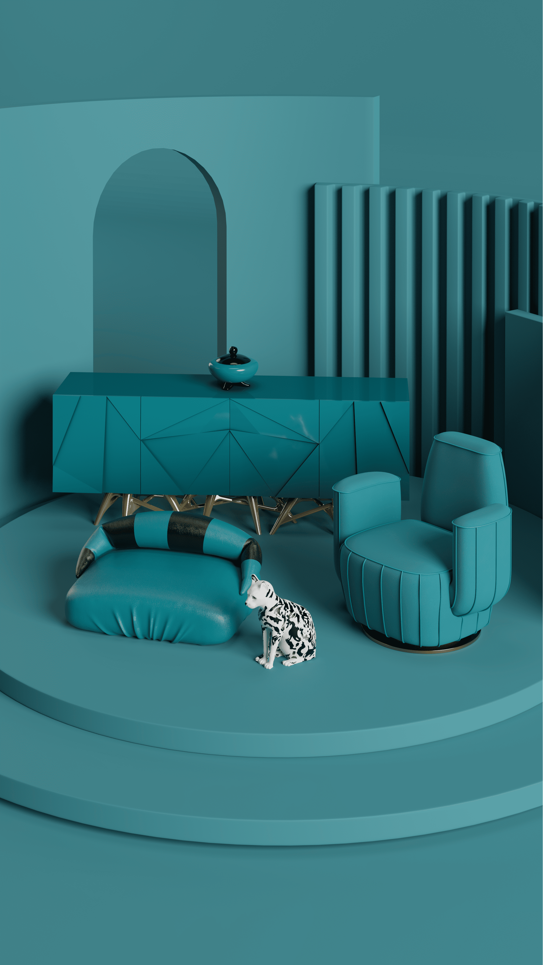
Harbor Blue is the perfect shade for a blinded and undisturbed space, such as bedrooms or wellness nooks. It gives you protection and strengthens your connection to the sea and the sky, especially under a Pisces moon.


WINERY
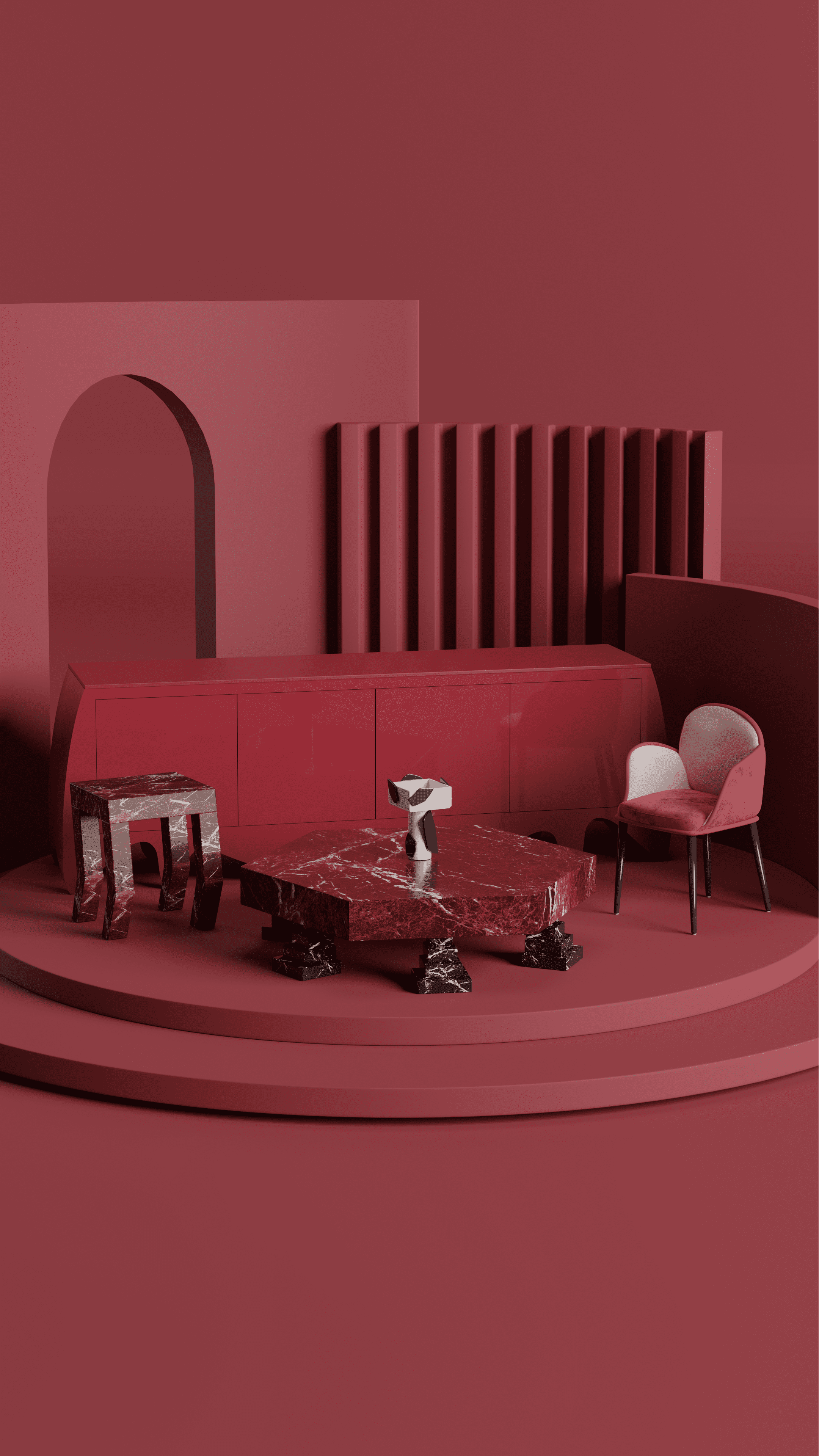
Some say red wine reduces the risk of depression and has long been thought of as a healthy heart. And while some raise their brows on this, many agree that red wine is the best remedy for all heartaches. If you’re not into drinking, still fill your home and intoxicate your brain with the most nostalgic pigment of all.


GREEN JADE
Jade is essentially tangible hope. It is the precious substance born under pressure and the celebration of resilience. Furthermore, Jade is a feminine color, as powerful as seductive. It will attract wealth, good health, and a bohemian lifestyle.


DARK OAK
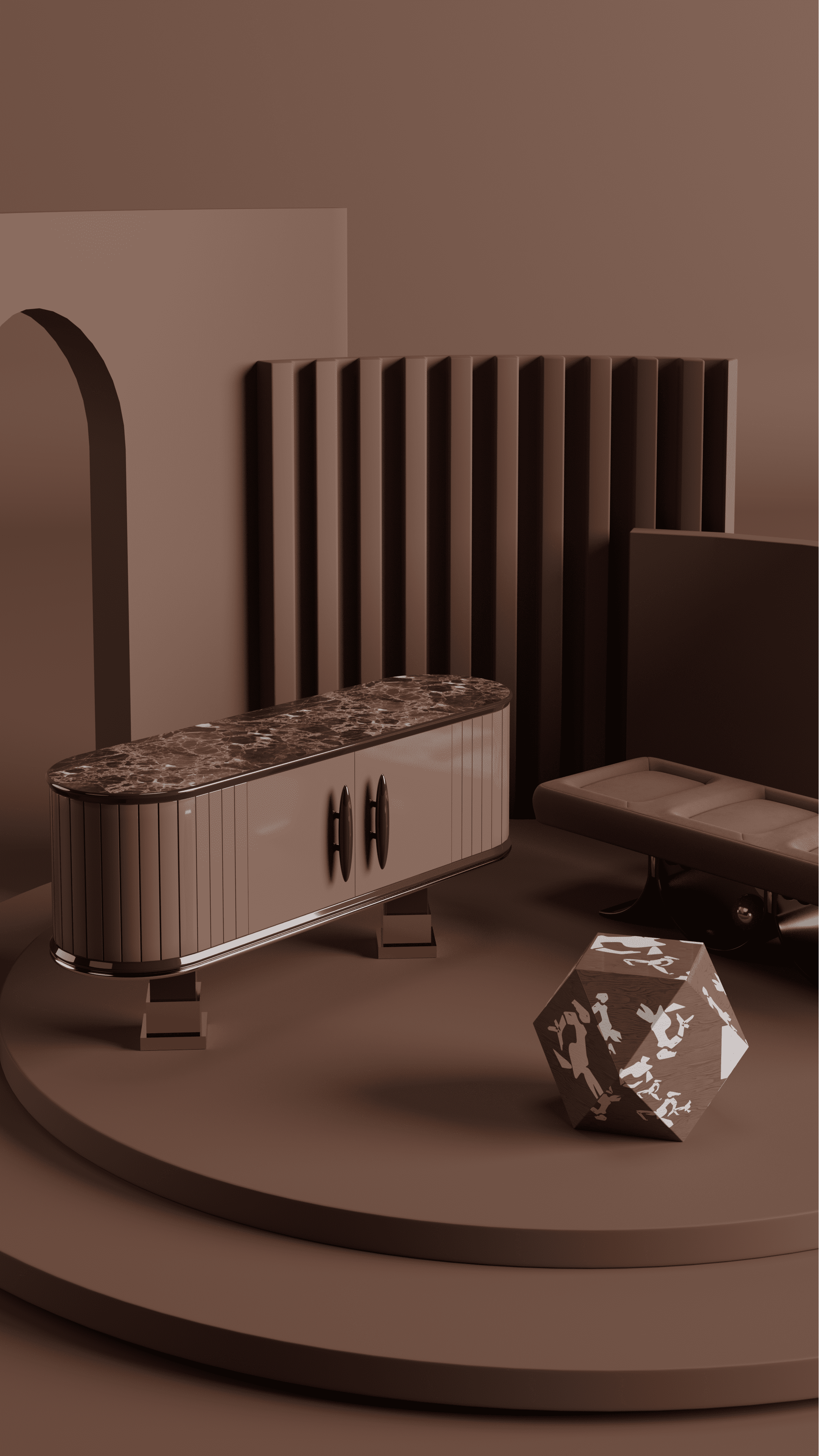
Dark Oak is the pigment that colors creative territories and blends an array of hues, decades, and interior design styles. It smells of compelling forests, tastes like Chelan cherries, and feels like a homecoming.


SOYBEAN
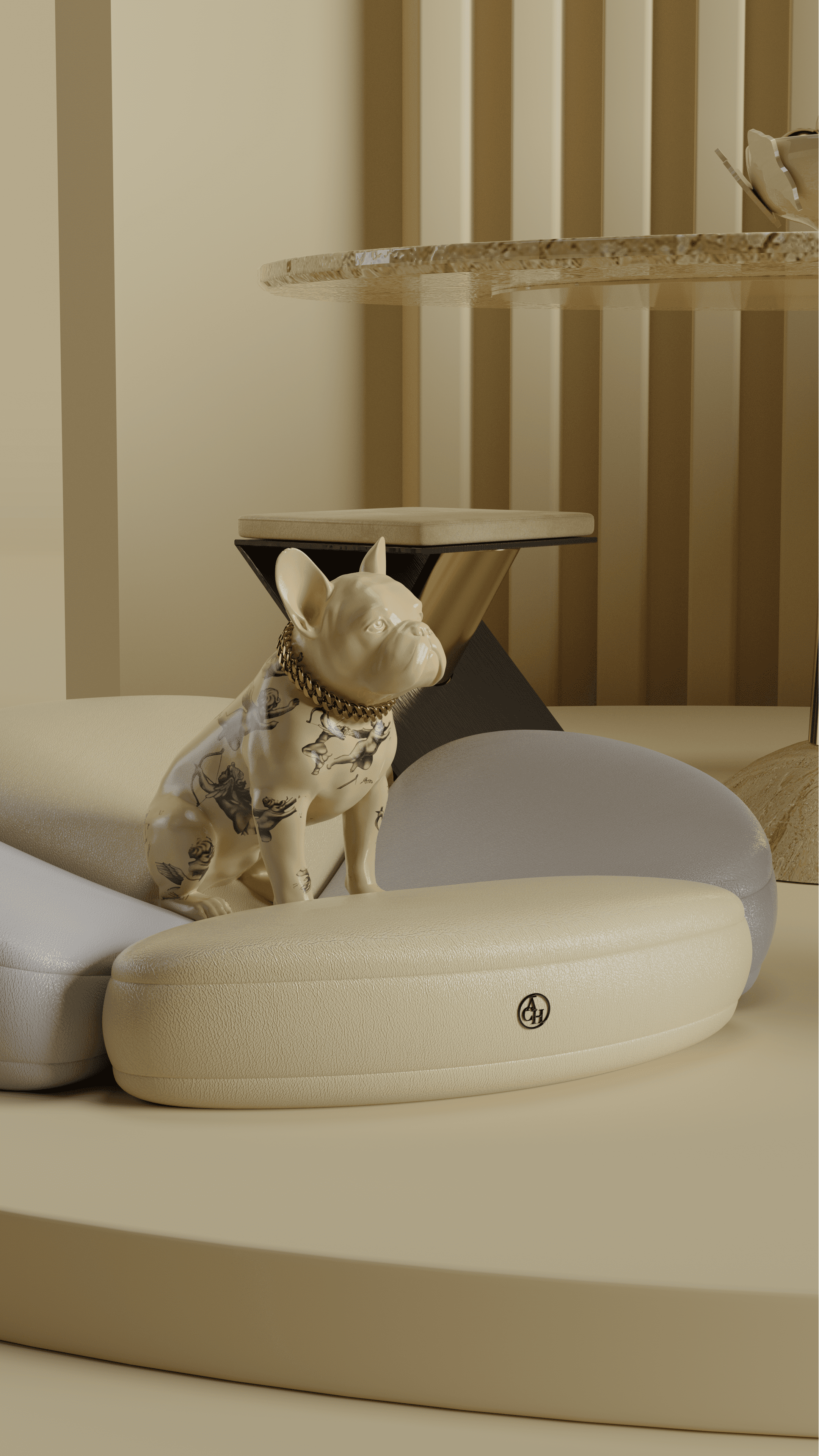
Soybean is a golden ticket to paradise. As time slows down, life is experienced intensively, and easiness is found in unpolished textures, organic materials, and handcrafted objects that turn homes into an essential piece of a mindful lifestyle.


DAFFODIL
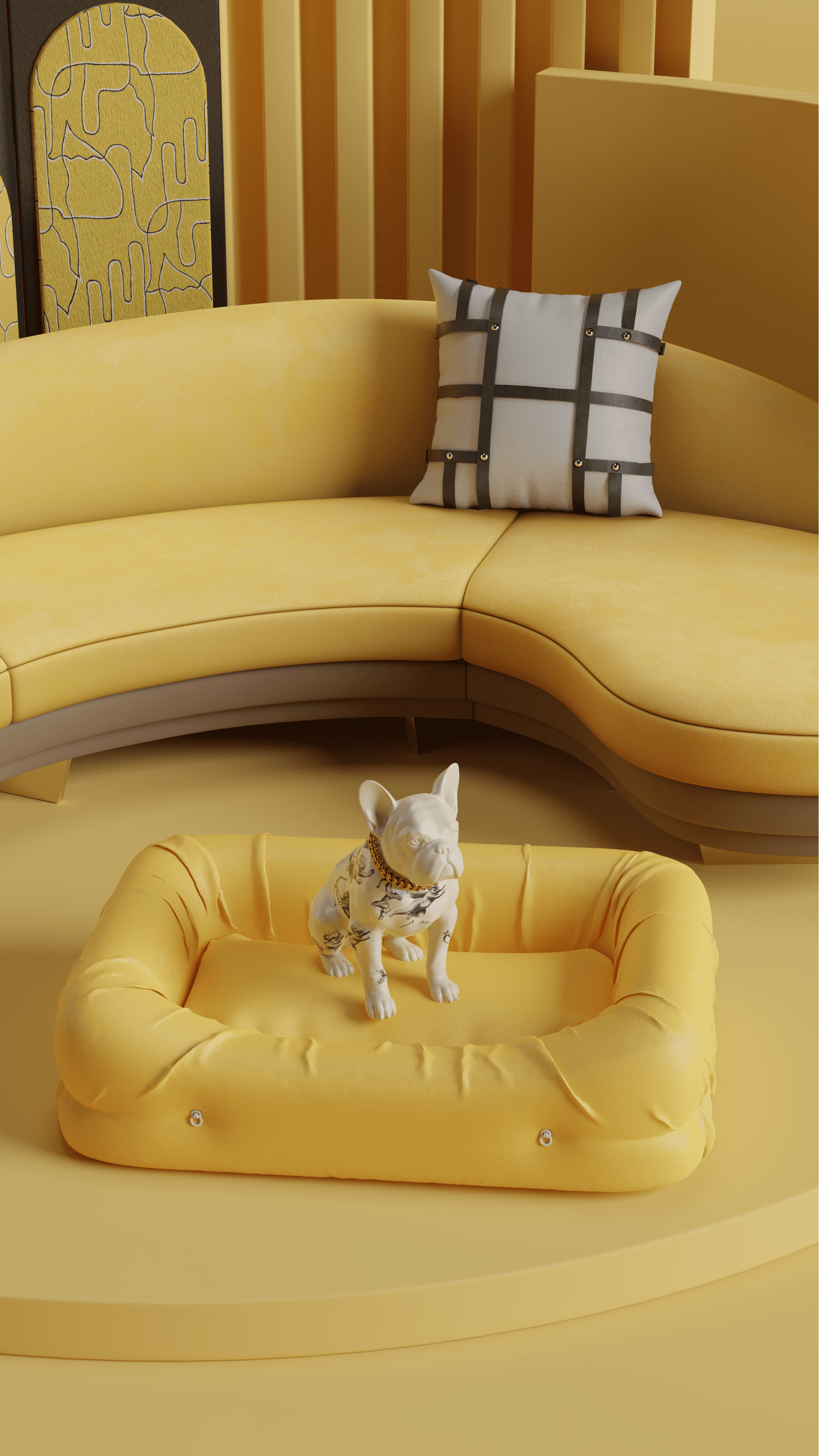
No color calls more the 60s and 70s Revival than Daffodil, the Flower Power color. Daffodil is the outset of cosmic joy that passionately celebrates resilience and optimism and pumps vital energy into any home.


ADOBE
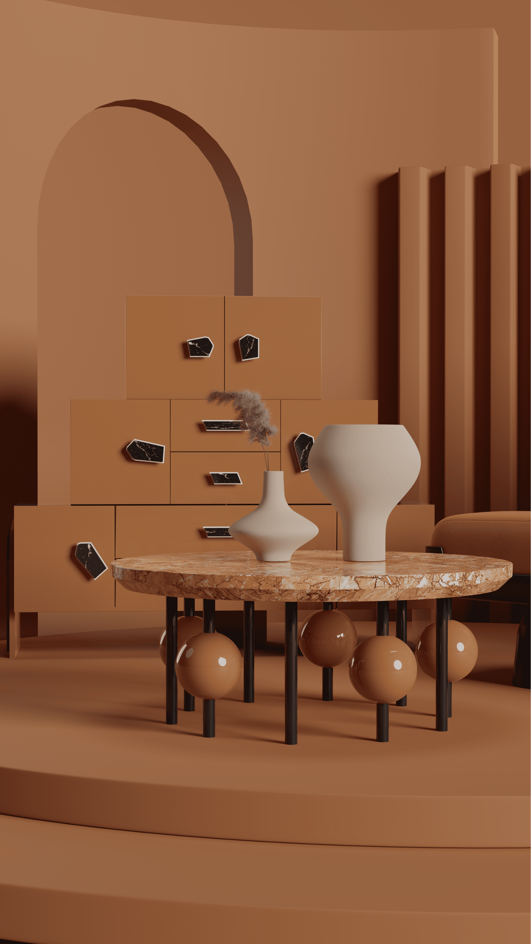
Adobe is unapologetically cosmopolitan and as funky as the 70s. It calls to the excitement, enthusiasm, and warmth and it sets the perfect ambiance for an elegant dining room where friends are closer, life is better and food is tastier.


NORTHERN DROPLET
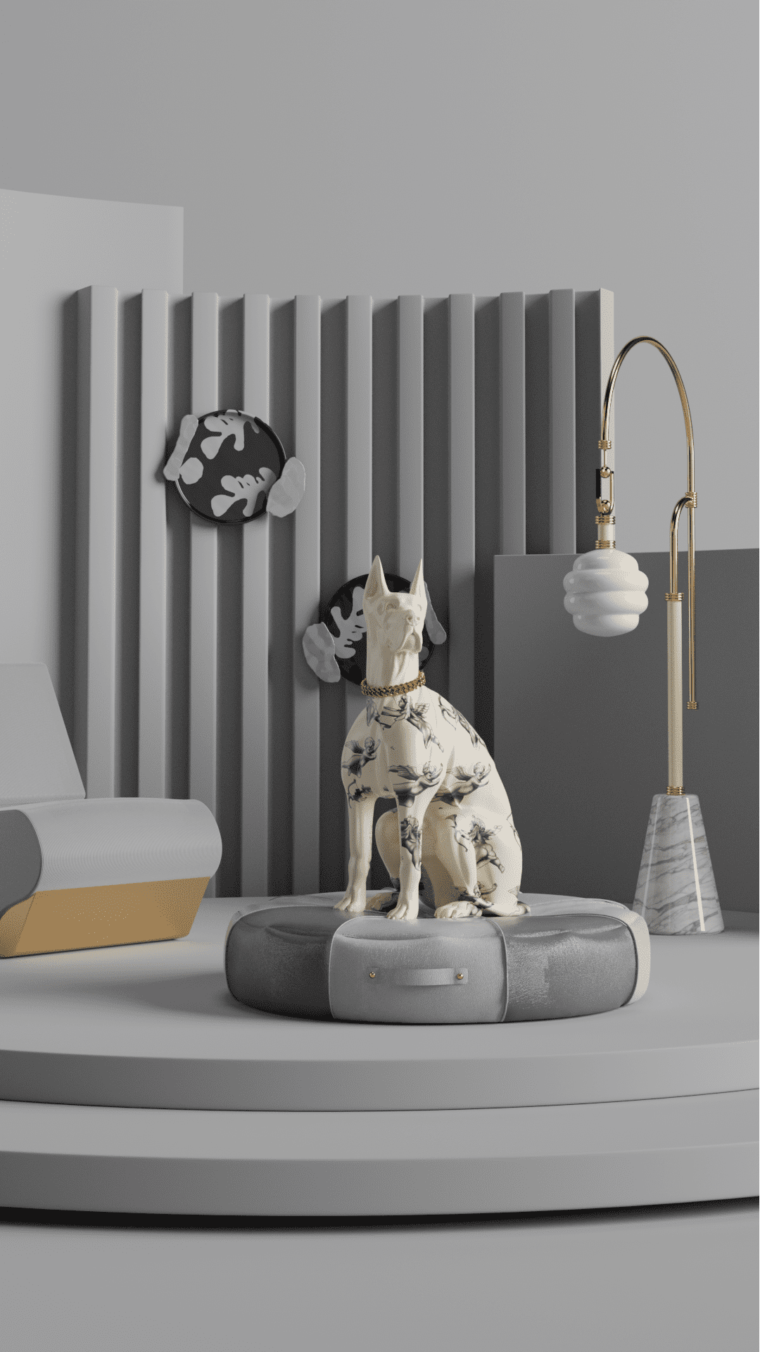
Northern Droplet cools down a blowup of warm feelings and emotions, keeping you down to earth. The neutral pigment balances an overwhelming color palette. It is a light grey with glimpses of light blue, a hue nostalgic enough to make any room feel like home.


SPRING LAKE
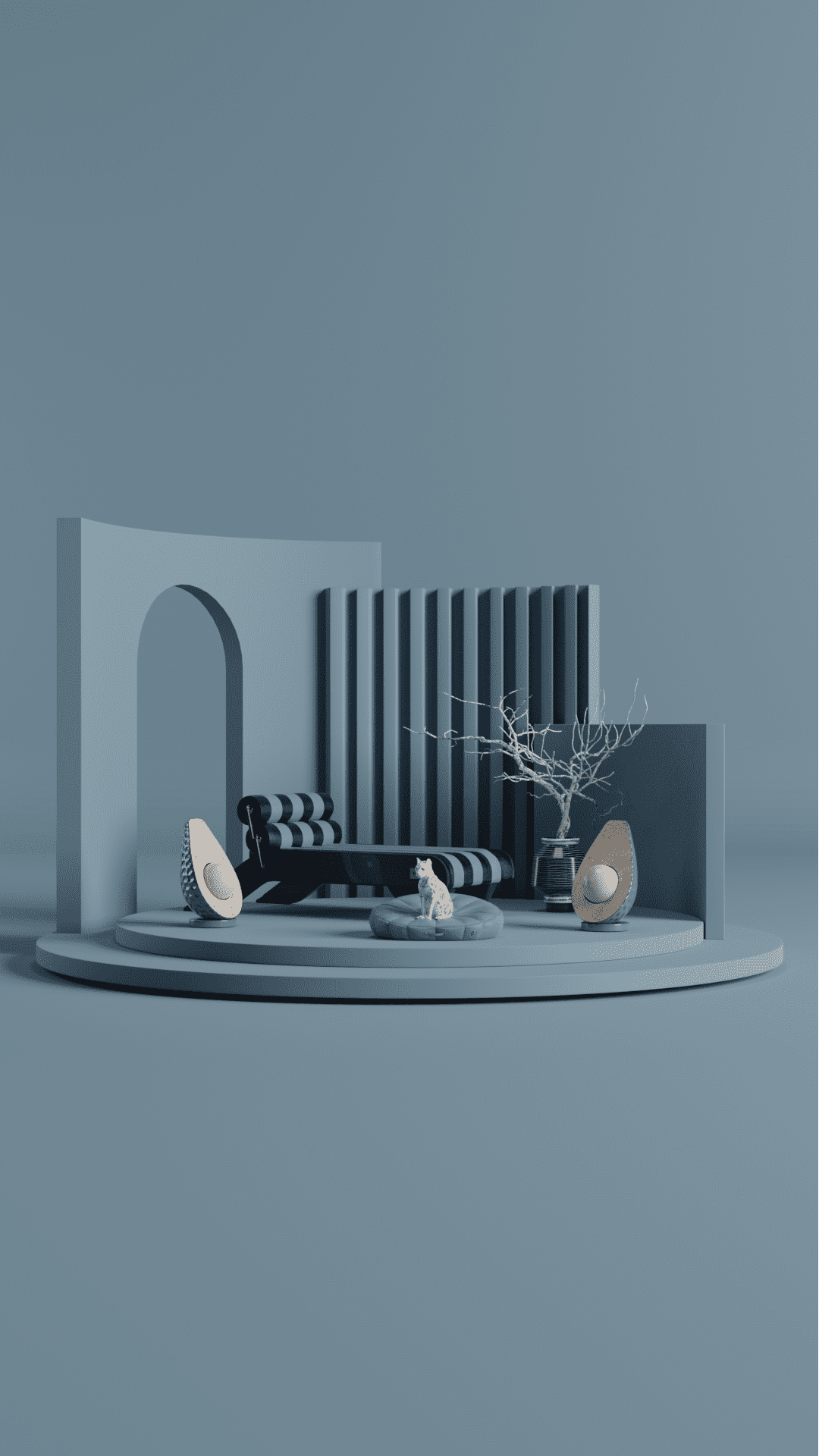
Spring Lake is the color of a childhood’s evening memory and the rise of a new morning under a foggy veil. It is the color of petrichor and the blend of time, past and present, and matter in any state dry and wet, liquid and solid. It is the color that balances a plethora of styles, decades, and emotions.

Trends 2022 are here to make a statement! All of these amazing colors will be an authentic success!